I’m hoping by now you are all well on the way to finding your feet, starting to create amazing photos and are ready to fly the nest very soon. There’s just two more things I’d like to share with you, Framing and Text (before I fly the nest myself and start my next blog on Meringue Kisses)
If you haven’t yet read Part 1, Part 2 and Part 3 you can read these first.
When I first started using Snapseed I was quite horrified at the thought of putting “wording” onto my beautiful photos but I’ve since discovered that if it’s done tastefully it’s a great tool for promoting your work. Text can be used for all sorts of situations, it can be used to show a website address at the bottom of a photo, or can be a huge block of information shouting something out about your work or a promotion, it can be in several places on the photo to create a story to engage your readers and friends and really helps you to express the way you feel about your work.
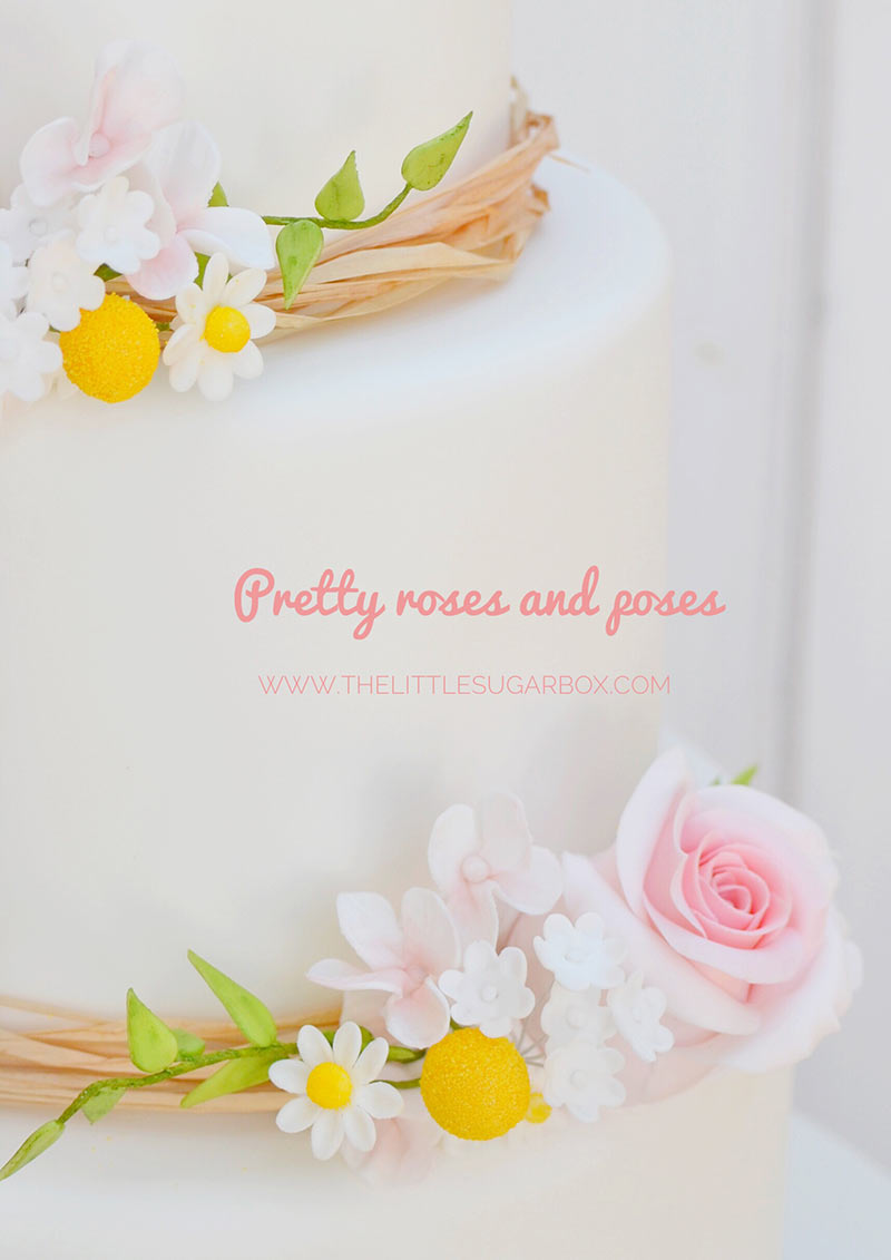
The main thing to remember about Text is not so much about how to do it but more about keeping things looking stylish/fitting. Have you ever looked at photos on Instagram that are smothered in bright green, scribbly writing in the middle and blocks of red at the top, bottom, sides and back…. This is the type of text I’m hoping you’ll avoid (or at least not show me).
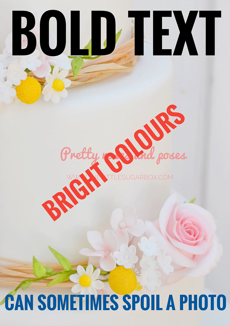
Before you start, think about the final look you’re trying to achieve. If you’re thinking of using text to promote one of your wedding cakes, try to pick colours that will compliment the overall picture and opt for a pretty text rather than a bold one. If, however, you’re putting text onto a photo of some brightly coloured childrens cupcakes, this is where you can have fun and chose bold print and colours to bring it all to life. Text can make or break a photo, so choose wisely, don’t spoil the finished image or ruin the message you’re trying to get across!!
The Text tool can be found right at the bottom of the tools page. Click on it and you’ll see three little pictures right at the bottom. There is a colour palette on the left, an opacity button in the middle and a little upside down book on the right. I‘ve found that I really only need to use the colour palette and little upside down book when adding text (I’m not sure “little upside down book” is the technical term but it does just look like a little upside down book to me!!)
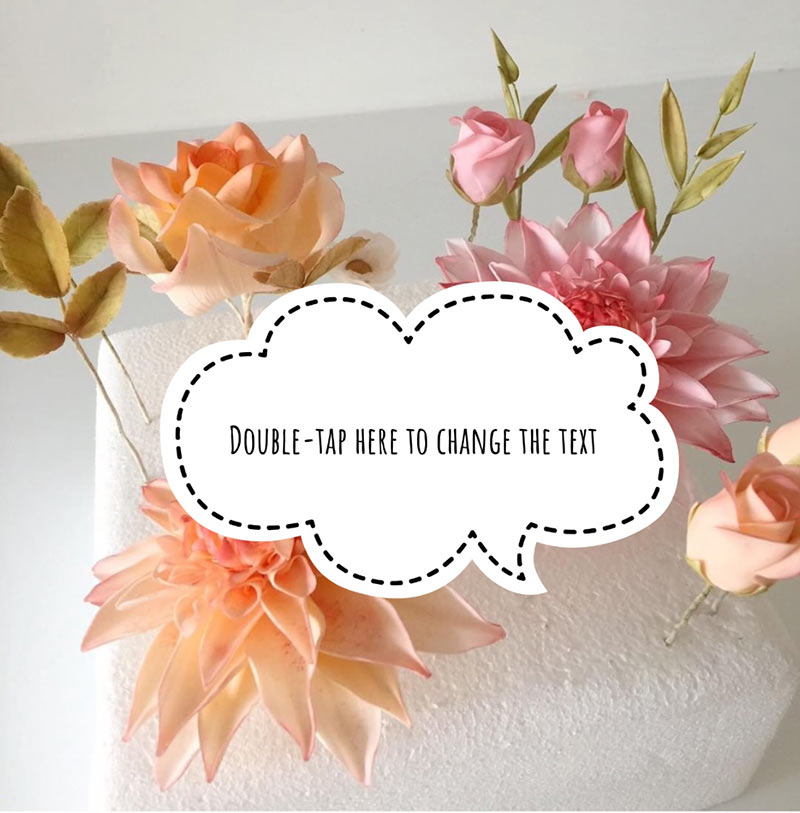
If you click on the little upside down book, lots of icons appear just above it (38 little icons to be precise). Scroll along the icons, select the one you want to use and then tap your finger on it. They are all very different so you’ll have fun trying them all out. The screen is actually quite helpful at this stage and guides you through the next step. It tells you to DOUBLE TAP HERE TO CHANGE THE TEXT and then shows you a little box which asks you to double tap again. Then you can put your chosen wording in, hit OK and you have text!!! Don’t worry if the text looks like a giant blob in the middle of the screen at this stage, I usually fix this at the end when I’m all done
You now get to pick a colour for your text!! This is the bit I enjoy playing around with the most because there’s so much choice. If you click on the colour palette tool at the bottom, a row of colours will appear. There’s a whopping 47 colours (yes, I counted them) AND a choice of light and dark when it comes to the greys and browns, which means you’re guaranteed to find what you’re looking for. I know it’s hard, but try to pick a colour that looks fantastic with your photo rather than choosing your favourite colour everytime. It will look much nicer!!!
You now get to pick a colour for your text!! This is the bit I enjoy playing around with the most because there’s so much choice. If you click on the colour palette tool at the bottom, a row of colours will appear. There’s a whopping 47 colours (yes, I counted them) AND a choice of light and dark when it comes to the greys and browns, which means you’re guaranteed to find what you’re looking for. I know it’s hard, but try to pick a colour that looks fantastic with your photo rather than choosing your favourite colour everytime. It will look much nicer!!!
Hit the Tick in the right hand corner as always ….. and you’re done!!!
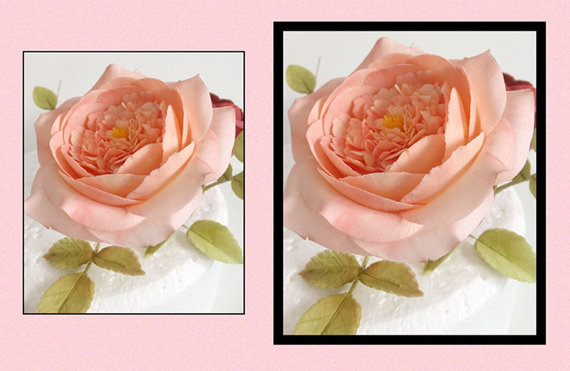
And finally, Frames!!! Another of my favourite tools in Snapseed. Tap the Frames tool and you’ll see lots of cool frames (23 to be precise…. I know, I have too much time on my hands). These are fun to play around with and you’ll be surprised at how much they can transform your photo. Tap on the one you like and it automatically sits around your picture. I stuck with the paler frames for ages as I found that black frames really overpowered my work until I realized that the frame size could be slimmed down. (another case of the penny dropping way too far down the line). At the very top of the page there’s a little blue rectangle, it doesn’t stand out like a sore thumb, which is why I think I missed it, but it changes the width of your chosen frame in seconds. If you move it to the left the frame gets thinner and to the right, thicker…. Genius!!!
Have fun with the frames, use the finest of frames for delicate work and big, chunky frames for your bolder stuff!!!
Don’t forget, I’d love to see your before and after photos. Email them to me at [email protected]
Ali xx
Newsletter
My studio is just 35 minutes away from London on the high speed train link and for those driving, 10 minutes from the motorway with plenty of FREE parking.
